


Blog
Responsive Web Design: Complete Guide for Modern Sites


Table of Contents
- The Foundation of Modern Web Design
- What Is Responsive Web Design?
- Why Responsive Design Matters for Your Business
- How Responsive Web Design Works in Practice
- Best Practices for Responsive Web Design
- Achieving Online Success with Responsive Design
The Foundation of Modern Web Design
Modern web design is no longer just about creating visually appealing pages — it is the cornerstone of a successful online presence. At its heart is responsive web design, which ensures seamless experiences across every device, from desktops to smartphones. This approach is now a standard expectation for users and search engines alike.
Beyond responsiveness, effective design integrates user experience and performance optimization. Page speed and mobile-friendliness are critical ranking factors for Google, directly impacting time on site and bounce rate. Partnering with a trusted website design company in Miami helps businesses build fast, engaging sites that meet these demands. Similarly, ecommerce website design in Miami requires a deep understanding of user behavior to streamline product discovery and checkout.
This is why many businesses turn to professional web design services to ensure their site meets today’s high standards. At SEOLocal, we integrate branding, functionality, and SEO from the start, creating a foundation for long-term growth. We focus on measurable outcomes, clear navigation, and adaptable templates that support growth across channels effectively. Without a modern site, businesses risk losing credibility and traffic to competitors.
What Is Responsive Web Design?
Responsive web design is an approach where a server sends the same HTML code to every device, and CSS rules adapt the layout based on screen size. This technique eliminates the need for separate mobile sites, making a single website accessible and visually coherent on desktops, tablets, and phones. Since over half of web traffic now comes from mobile devices, delivering a seamless experience across all breakpoints is no longer optional — it’s the foundation of modern web architecture.
Core Components: Fluid Grids, Flexible Images, and Media Queries
The mechanics of responsive web design rest on three technical pillars. Fluid grids use relative units like percentages rather than fixed pixels, so column widths resize proportionally to the viewport. Flexible images are scaled with max-width: 100% to prevent them from overflowing their containers on smaller screens. CSS media queries detect device characteristics — most commonly screen width — and apply targeted style rules at defined breakpoints. Together, these components form a system that reflows content without horizontal scrolling. As a website design company, we depend on precisely these elements in responsive web design to ensure every site we launch performs reliably. Our web development services always include fluid grids, flexible media handling, and carefully tuned media queries, because these building blocks are what make a layout truly device-agnostic.
Responsive vs. Adaptive vs. Separate Mobile Sites
Understanding responsive design requires contrasting it with two legacy approaches. Adaptive design sends entirely different HTML and CSS combinations based on pre-selected breakpoints, often requiring separate templates for mobile and desktop. This can create maintenance overhead and inconsistent user journeys. Separate mobile sites go further by using distinct URLs — typically m.example.com — that duplicate content and fragment SEO signals. Responsive design, by contrast, serves one codebase under a single URL, which simplifies updates and consolidates ranking authority. For ecommerce website design, this unification is especially valuable: product listings, shopping carts, and checkout flows work from the same canonical pages, reducing duplicate-content risks and giving users a consistent purchase path on any device.
Why Google Recommends Responsive Design
Google’s own documentation explicitly recommends responsive web design because it makes crawling and indexing far more efficient. A single URL means search engine bots only have to visit one location to discover all of a site’s content, saving crawl budget. That same single-URL structure also improves user experience: mobile visitors who land on a properly responsive page are far less likely to bounce than those redirected to a stripped-down separate mobile site. When a site detects a smartphone and immediately reflows text, images, and navigation without requiring a separate subdomain, visitors stay engaged longer. This is why we build all our projects with a responsive foundation — every site we deliver is designed to be mobile-friendly from the very first commit, aligning with Google’s recommendations and the expectations of today’s on-the-go audience.
Why Responsive Design Matters for Your Business
In today’s mobile-first world, responsive web design is no longer optional—it’s essential for any business that wants to stay competitive. Moving beyond definitions, here’s why responsive design directly impacts your bottom line.
Superior User Experience Across All Devices
A single responsive site fluidly adapts to any screen, eliminating frustrating pinch-to-zoom and horizontal scrolling. This seamless browsing leads to longer session durations and lower bounce rates—both signals that a visitor is engaged. In Miami, where on-the-go mobile use is widespread, users expect websites to load quickly and look flawless on their phone, tablet, or desktop. When your brand appears consistently professional across every device, trust builds, and conversion rates rise. We design with this uniform experience in mind, so that navigation, images, and calls to action remain intuitive whether a customer visits from a smartphone or a large monitor. A site that works beautifully everywhere turns casual browsers into committed customers.
SEO Advantages for Your Business
Responsive design consolidates all your SEO signals onto a single URL, so every backlink and citation strengthens one address. Because mobile-friendliness is a confirmed ranking factor, a site that renders perfectly on any screen sends powerful quality cues to search engines. You also avoid the duplicate content penalties that can hurt sites running separate mobile versions, which further strengthens your search engine presence. As a website design company in Miami, we harness an AI-driven local SEO platform to help your business appear prominently for location-based searches, all without complex technical work. Our website design services embed responsive principles that naturally boost mobile-friendliness and SEO signals. This makes it easier for Miami customers to discover you, and we deliver Fast SEO Results! without ever tying you into long-term contracts.
Cost Efficiency and Easy Maintenance
Running separate mobile and desktop sites multiplies your hosting, content updates, and backlink-building costs. A single responsive site eliminates duplicate efforts and slashes maintenance time. For ecommerce website design, a unified responsive platform streamlines inventory management and checkout across all devices—reducing errors and support tickets. Responsive web design also future-proofs your business against new device formats like foldables and oversized tablets, so you avoid costly redesigns down the road. Think of it as maintaining one engine that powers every device, rather than building a separate engine for each platform. That simplicity translates directly into lower long-term costs. We build every site on a flexible foundation, backed by our no contract or commitment model and a 30-day trial that lowers your risk while you get started. A fluid, single-site approach keeps your online presence lean, powerful, and ready to scale.
How Responsive Web Design Works in Practice
Moving from theory to practice, here’s how we build a responsive site step-by-step. Responsive web design is a practical process that ensures seamless experiences across all devices, and our methodology at SEOLocal covers every critical stage.
The process can be visualized in three key stages:
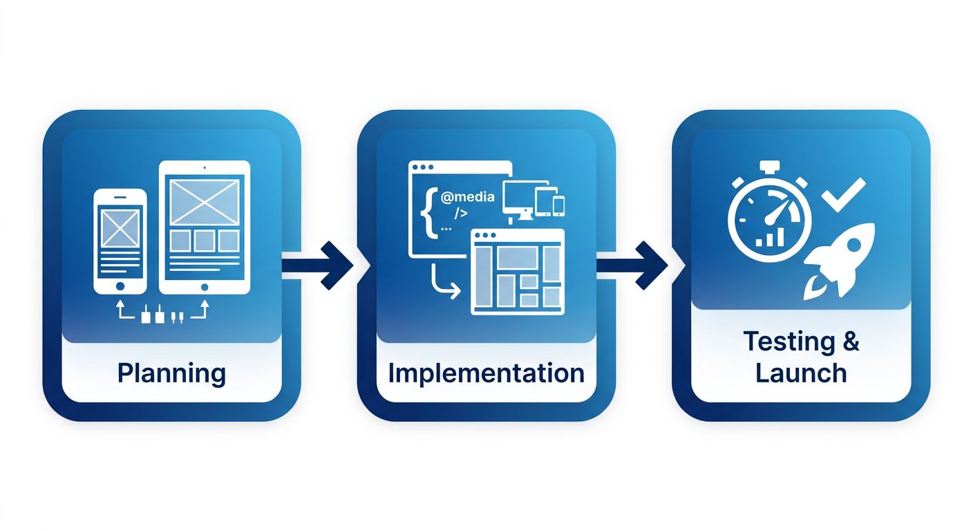
Responsive web design process from planning to launch
Planning and Setting Breakpoints
Effective responsive web design starts with data. We analyze audience analytics to identify the most common device widths – typically 320px for mobile phones, 768px for tablets, and 1024px for small desktops. These breakpoints are not universal; they are chosen to match your users’ real-world screens. We then create mobile-first wireframes that prioritize the smallest screen, ensuring core content and CTAs are accessible on any device. This approach lays a solid foundation before scaling layouts up for larger screens. As a website design company in Miami, we build a reusable component library that guarantees visual consistency across breakpoints while streamlining future updates. By planning breakpoints around user behavior, the resulting responsive web design directly supports higher engagement and conversion rates.
Implementation: From Wireframe to Responsive Code
Translating wireframes into code is where responsive web design truly comes to life. We use CSS media queries to apply different style rules at each breakpoint, swapping grid layouts, font sizes, and image scales fluidly. Instead of fixed pixels, all measurements are expressed in relative units like percentages, em, and rem, allowing elements to resize proportionally with the viewport. This fluid design ensures a single codebase adapts from a smartphone to a widescreen monitor without losing usability. For ecommerce projects, our ecommerce website design in Miami follows the same rigorous approach, keeping product grids, carts, and checkout flows fully mobile-friendly. We test layouts in browser developer tools, then validate on a matrix of physical devices to catch subtle layout quirks. These technical steps form the core of our comprehensive web development services.
Testing, Launch, and Ongoing Optimization
Before any responsive site goes live, rigorous QA is mandatory. We start with emulator checks and browser dev tools, then move to real devices—popular iPhones, Android phones, and tablets—to verify touch targets and navigation. Performance testing is equally critical; we run Google’s PageSpeed Insights and Lighthouse audits to measure load times, identify render-blocking resources, and ensure the site meets industry standards. These audits catch issues that could erode user trust and conversion rates. Post-launch, monitoring continues. We use heatmaps and click tracking to see how visitors interact with the responsive layout. This data fuels iterative refinements—adjusting breakpoints, simplifying navigation, or resizing CTAs—to continuously improve the user journey. Our web development services encompass this entire lifecycle, from planning through ongoing optimization, so every site we deliver remains performant and aligned with your business goals.
Best Practices for Responsive Web Design
Responsive web design is essential for delivering a consistent and engaging user experience across every device. By adapting layout, content, and functionality to screen size, a responsively designed site improves usability and search visibility. The following practices outline how to build a high-performing website that serves every visitor effectively.
Embrace a Mobile-First Strategy
A key starting point for any responsive web design project is embracing a mobile-first strategy. Designing for the smallest screen forces teams to prioritize essential content and functionality, stripping away non-critical elements that can slow performance and confuse users. Because Google predominantly uses mobile-first indexing, a mobile-first build directly supports stronger SEO outcomes. When you partner with a website design company like SEOLocal in Miami, FL, you can be confident that every project starts with the smallest screen in mind. Our website design services implement this philosophy by combining clean, conversion-focused layouts with technical SEO from the outset. A mobile-first architecture also naturally elevates local SEO signals—like tap-to-call buttons and address visibility—which are vital for businesses serving communities near Miami.
Prioritize Performance and Speed
Performance directly impacts user satisfaction and search rankings. A responsive web design must load quickly on all connections, especially on mobile networks where bandwidth may be limited. We recommend compressing images into next-generation formats like WebP or AVIF, which dramatically reduce file sizes without sacrificing visual quality. For JavaScript-heavy pages, code splitting ensures that only the necessary scripts load on each page, keeping initial payloads light. Reducing server response time to under 200 milliseconds is equally critical; optimizing server configuration and leveraging a content delivery network can achieve this target. Tools such as Google PageSpeed Insights and GTmetrix offer actionable diagnostics, and our local search performance dashboards provide ongoing monitoring of these metrics, helping businesses quickly identify and fix slowdowns. Even a one-second delay can hurt conversions, making speed tuning mandatory for competitive ecommerce sites.
Accessibility, Typography, and Touch Targets
A universally usable website requires attention to accessibility and readability. We recommend setting a base font size of 16 pixels for body text to ensure comfortable reading on all screens, with line heights that promote scannability. Interactive elements must meet a minimum touch target size of 48-by-48 CSS pixels, as recommended by WCAG 2.1, to prevent accidental taps and frustration on mobile devices. Using semantic HTML elements—such as <nav> for navigation, <main> for primary content, and <article> for standalone pieces—helps screen readers interpret the page structure accurately, improving the experience for users with disabilities. For ecommerce website design, large touch targets are especially critical on product pages and during checkout flows, where a mis-tap can lead to cart abandonment. These accessibility and usability practices not only serve all visitors better but also align with search engines’ emphasis on user experience signals, reinforcing overall SEO.
Achieving Online Success with Responsive Design
One of the most critical elements of modern web design is responsive web design, which automatically adapts a website to desktops, tablets, and smartphones. This approach is essential today because Google uses mobile-first indexing, making mobile usability a direct ranking factor. By serving a single, flexible site, businesses avoid the duplicate content issues that arise from maintaining separate mobile versions.
From an SEO perspective, responsive design consolidates all content and links under one URL structure, simplifying on-page optimization for any website design company managing client campaigns. For ecommerce website design, a mobile-friendly layout is crucial to reducing cart abandonment, as shoppers increasingly browse and buy on their phones. A responsive site also lowers bounce rates and increases dwell time — user behavior signals that search engines interpret as positive quality indicators — without the added cost of a separate mobile build.
SEOLocal’s white-label development packages include responsive design as a core deliverable, enabling our partners to offer comprehensive, SEO-friendly websites to their customers with zero overhead. Beyond design, for teams looking to deepen their expertise, Responsive design training from CXL offers advanced strategies to maximize ROI and help clients achieve Fast SEO Results!. Results may vary.
Resources
- Choose Functional Website Design for Local SEO Success
- Invest in Technical Web Development for Local Search Wins
- Integrate Web Design and SEO for Business Growth
- Track Local Search Performance with Specialized Dashboards
- Drive Local SEO Results with Strategic Social Media Management
- Try Quality White Label SEO Services with Free Trial
- Find Localized PPC Management with Flexible Trial Offer
- Master Marketing Skills with Expert-Led Online Training