
Blog
Boost Your Site’s Performance with Effective Mobile Optimization

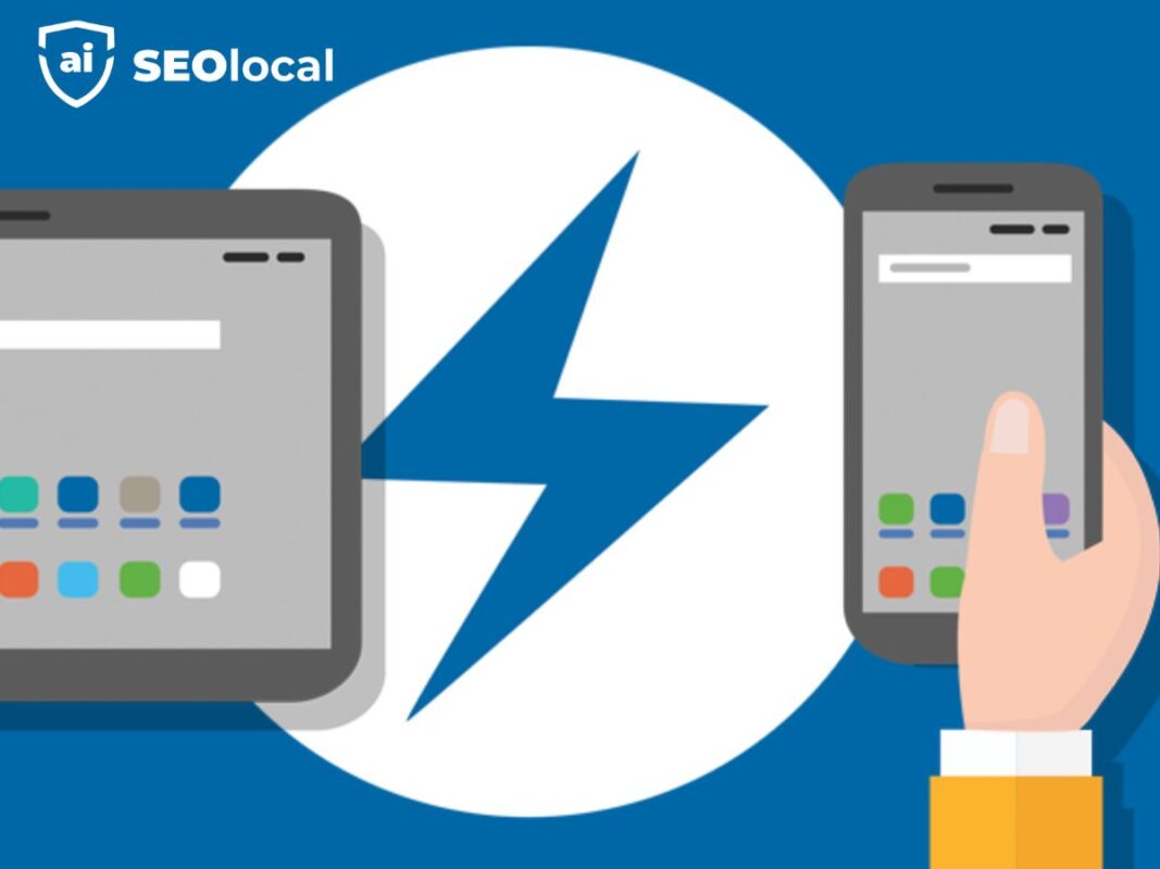
Did you know over 60% of internet traffic comes from smartphones and tablets? If your site isn’t built for these devices, you’re missing out on a massive audience. Google now prioritizes mobile-friendly pages in search results, making it a must for ranking and visibility.
A fast, responsive design keeps visitors engaged. Slow-loading pages frustrate users and hurt your search rankings. By improving your site’s speed and usability, you enhance both performance and user experience.
SEO Local helps businesses adapt to these changes. Need expert advice? Chat with us on WhatsApp for tailored solutions.
Key Takeaways
- Mobile devices drive most web traffic today.
- Google ranks mobile-friendly sites higher.
- Slow load times hurt engagement and SEO.
- Responsive design improves user experience.
- Speed optimization boosts overall performance.
What Is Mobile Optimization?
Ever struggled to read tiny text or tap small buttons on a phone? That’s where mobile optimization comes in. It tailors your site to work seamlessly on smartphones and tablets, ensuring visitors stay engaged.
Defining the Process
Mobile optimization adjusts layouts, images, and interactions for smaller screens. It’s not just shrinking a desktop site—it’s redesigning for touch controls, faster load times, and on-the-go browsing.
Key Differences from Desktop
Desktop designs assume a mouse and large screen. Mobile devices need larger buttons, simplified menus, and faster-loading content. Here’s how they compare:
| Feature | Desktop | Mobile |
|---|---|---|
| Navigation | Dropdown menus | Hamburger menus |
| Input | Mouse clicks | Touch gestures |
| Content Layout | Multi-column | Single-column |
Bandwidth also matters. Mobile users often rely on slower connections, so compressed images and lightweight code are essential.
Why Mobile Optimization Matters
Smartphones now drive more web visits than desktops—are you prepared? Over 57% of global traffic comes from mobile devices, with the U.S. exceeding 60%. If your site isn’t tailored for smaller screens, you risk losing visitors and revenue.
Mobile Traffic Dominance
Phones aren’t just for scrolling—they’re shopping, researching, and connecting. Here’s how device usage breaks down:
| Metric | Desktop | Mobile |
|---|---|---|
| Traffic Share | 43% | 57% |
| Bounce Rate | 42% | 58% |
| Conversion Rate | 3.9% | 2.7% |
Mobile users expect speed. Pages that load in under 3 seconds keep them engaged. Slow sites see bounce rates spike by 32%.
Impact on User Experience and SEO
Google’s search engine now uses mobile-first indexing. If your site isn’t responsive, rankings drop. Local searches on phones lead to 78% of in-store purchases—missing this hurts brick-and-mortar sales.
Fix these issues to stay competitive:
- Speed up load times with compressed images.
- Simplify navigation for touchscreens.
- Test with tools like Google’s Mobile-Friendly Test.
Responsive Design: The Foundation of Mobile Optimization
A seamless experience across devices starts with responsive design. It ensures your site looks great and functions well on any screen size, from desktops to smartphones. This approach is essential for keeping users engaged and improving your site’s performance.
How Responsive Design Works
Responsive design uses CSS3 media queries to adapt your site’s layout to different screens. These queries detect the user’s device and adjust the design accordingly. Instead of fixed pixels, percentage-based grids ensure flexibility. This allows your content to scale smoothly across devices.
Implementing Fluid Grids and Flexible Layouts
Fluid grids are the backbone of responsive design. They use relative units like percentages rather than fixed widths. This ensures your layout adjusts to fit any screen size. Here’s how to get started:
- Use the viewport meta tag to control scaling on different devices.
- Define breakpoints for specific screen sizes to optimize layouts.
- Scale images proportionally to maintain quality on all screens.
For example, a fluid grid system might look like this in CSS:
.container {
  width: 100%;
  max-width: 1200px;
  margin: 0 auto;
}
.column {
  width: 50%;
  float: left;
}
This approach ensures your site is flexible and user-friendly on all devices.
Accelerated Mobile Pages (AMP) for Lightning-Fast Loading
Are your pages loading fast enough to keep users engaged? Accelerated Mobile Pages (AMP) is a framework designed to create lightweight, high-speed pages. With AMP, your site can load up to 85% faster, ensuring visitors stay longer and convert more often.
Benefits of AMP
AMP improves Core Web Vitals, which are critical for SEO rankings. Faster load times reduce bounce rates and enhance user experience. Additionally, AMP pages often appear in Google’s Top Stories carousel, increasing visibility.

Here’s why AMP is a game-changer:
- Boosts page speed and performance.
- Enhances user engagement and retention.
- Improves SEO rankings and discoverability.
How to Implement AMP on Your Site
Implementing AMP requires simplified HTML and restricted CSS/JavaScript. Start by creating a separate AMP version of your pages. Use the AMP library to ensure compatibility with the framework.
Follow these steps to convert your site:
- Install the AMP plugin if you’re using a CMS like WordPress.
- Validate your AMP pages using Google’s AMP Validator.
- Test for compatibility with your existing site structure.
While AMP offers significant benefits, it’s essential to consider potential limitations. Some dynamic features may not work, and maintaining two versions of your site can be resource-intensive. However, the speed and SEO advantages often outweigh these challenges.
Optimizing Page Speed for Mobile Devices
In 2024, fast-loading pages are no longer optional—they’re essential for success. Slow-loading sites frustrate users and hurt your search rankings. By focusing on speed, you can improve both user experience and site performance.
Compressing Images and Minifying Code
Compressed images can reduce load times by 40-70%. Modern formats like WebP and AVIF offer high quality with smaller file sizes. Minifying code removes unnecessary characters, making your site lighter and faster.
Here’s how to optimize your site:
- Use tools like TinyPNG or Squoosh for image compression.
- Minify CSS, JavaScript, and HTML with tools like UglifyJS or CSSNano.
- Test your site’s speed with Google PageSpeed Insights.
Leveraging Browser Caching
Browser caching can decrease repeat visit load times by over 50%. It stores static files locally, so users don’t need to download them again. This improves speed and reduces server load.
To implement caching:
- Set cache headers for static resources like images and CSS.
- Use tools like GTmetrix to test caching effectiveness.
- Monitor performance regularly to ensure optimal results.
| Metric | 2024 Benchmark |
|---|---|
| Page Load Time | Under 3 seconds |
| First Contentful Paint | Under 1.8 seconds |
| Time to Interactive | Under 2.5 seconds |
By following these steps, you can ensure your site meets modern speed standards. Faster pages keep users engaged and improve your search rankings.
Enhancing User Experience on Mobile
Creating a seamless experience for mobile users starts with thoughtful design choices. Smaller screens and touch-based interactions require unique approaches to keep visitors engaged. By focusing on intuitive navigation and well-structured content, you can ensure your site meets user expectations.
Touch-Friendly Buttons and Navigation
Designing for touchscreens means larger buttons and simplified menus. The recommended minimum touch target size is 48×48 pixels to prevent accidental clicks. This “fat finger” design principle ensures users can interact with your site effortlessly.
Here are some best practices for touch-friendly design:
- Use clear, large buttons for primary actions.
- Space out interactive elements to avoid misclicks.
- Implement hamburger menus for streamlined navigation.
Prioritizing Content for Smaller Screens
Mobile users scroll 2.5 times more than desktop users, so content hierarchy is crucial. Place the most important information at the top, and use concise, scannable text. Break up long paragraphs with headings, bullet points, and visuals.
Here’s how desktop and mobile design differ:
| Feature | Desktop | Mobile |
|---|---|---|
| Button Size | Smaller, precise clicks | Larger, touch-friendly |
| Content Layout | Multi-column | Single-column |
| Navigation | Dropdown menus | Hamburger menus |
By adapting your design to these principles, you can create a user-friendly experience that keeps visitors engaged on any device.
Mobile SEO Best Practices
With over 76% of searches having local intent, mobile SEO is more critical than ever. Tailoring your site for mobile users ensures better visibility and engagement. By focusing on mobile-specific ranking factors and structured data, you can boost your site’s performance in search results.
Schema Markup for Rich Snippets
Rich snippets can increase click-through rates by 30% on mobile. Schema markup helps search engines understand your content better, leading to enhanced listings. Implementing structured data for reviews, FAQs, and events makes your site stand out in search results.
Here’s how to get started with schema markup:
- Use tools like Google’s Structured Data Markup Helper.
- Add JSON-LD code to your site’s HTML.
- Test your markup with Google’s Rich Results Test.
Local SEO Optimization for Mobile
Local searches on mobile devices often lead to in-store visits. Ensuring your NAP (Name, Address, Phone) information is consistent across platforms is crucial. Voice search optimization also plays a key role, as many users rely on voice assistants for local queries.
Here’s a comparison of desktop and mobile SEO ranking factors:
| Factor | Desktop | Mobile |
|---|---|---|
| Page Speed | Important | Critical |
| Local Listings | Moderate | High |
| Structured Data | Beneficial | Essential |
By focusing on these mobile-specific strategies, you can improve your site’s visibility and user experience.
Testing Your Mobile Site with Google’s Tools
Google’s tools can help you ensure your site is ready for mobile users. Testing your site’s compatibility and performance is essential for delivering a seamless experience. With free tools like Google’s Mobile-Friendly Test and PageSpeed Insights, you can identify issues and improve your site’s functionality.
Using Google’s Mobile-Friendly Test
Google’s Mobile-Friendly Test evaluates how well your site renders on smaller screens. It checks for usability issues like text size, button spacing, and viewport settings. This tool provides a clear report, highlighting areas that need improvement.
Here’s how to interpret the results:
- Pass: Your site meets mobile-friendly standards.
- Fail: Issues like unreadable text or blocked resources are flagged.
- Recommendations: Specific fixes to enhance usability.
Analyzing Performance with PageSpeed Insights
PageSpeed Insights dives deeper into your site’s performance. It measures Core Web Vitals like loading speed, interactivity, and visual stability. The tool provides actionable recommendations to optimize your site for better user experience and SEO rankings.
Key metrics to focus on:
- First Contentful Paint (FCP): Time to display the first content.
- Largest Contentful Paint (LCP): Time to load the main content.
- Cumulative Layout Shift (CLS): Visual stability during loading.
| Feature | Mobile-Friendly Test | PageSpeed Insights |
|---|---|---|
| Purpose | Evaluates rendering and usability | Analyzes performance metrics |
| Key Output | Pass/Fail with recommendations | Detailed performance scores |
| Focus | Mobile compatibility | Speed and Core Web Vitals |
By using these tools together, you can create a mobile-friendly site that performs well and keeps users engaged. Regular testing ensures your site stays ahead of the competition.
Common Mobile Optimization Mistakes to Avoid
Are you unknowingly making mistakes that hurt your site’s performance? Even small errors can lead to significant issues, affecting both usability and rankings. By identifying and fixing these common pitfalls, you can ensure your site stays competitive and user-friendly.
Blocking CSS, JavaScript, or Images
Blocking essential resources like CSS, JavaScript, or images can harm your site’s functionality. These elements are crucial for rendering your pages correctly. When blocked, users may see broken layouts or missing content, leading to a poor user experience.
Search engines also penalize sites with blocked resources, as they can’t fully crawl and index the content. To avoid this, ensure all critical files are accessible. Use tools like Google Search Console to identify and fix blocking issues.
Using Intrusive Pop-Ups and Flash
Intrusive pop-ups and outdated technologies like Flash can frustrate users. Studies show that 73% of visitors abandon sites with disruptive pop-ups. These elements not only harm user experience but also negatively impact SEO rankings.
Modern alternatives like non-intrusive banners or delayed pop-ups are more effective. Avoid Flash altogether, as it’s no longer supported by most browsers. Instead, use HTML5 and CSS3 for animations and interactive features.
By addressing these issues, you can create a seamless experience for your visitors. Regularly test your site to ensure it meets current standards and provides a positive user experience.
Staying Ahead: Emerging Trends in Mobile Optimization
The digital landscape is evolving rapidly, and staying ahead means adapting to emerging trends. As technology advances, new strategies like voice search and progressive web apps (PWAs) are reshaping how users interact with websites. By embracing these innovations, you can future-proof your site and enhance its performance.
Voice Search Optimization
Voice search is becoming a dominant force in digital interactions. By 2024, 55% of households in the U.S. are expected to own smart speakers. This shift means optimizing for voice queries is essential. Users often phrase voice searches differently than typed queries, focusing on natural language and long-tail keywords.

To prepare for this trend, consider these steps:
- Focus on conversational keywords that match how people speak.
- Optimize for local searches, as many voice queries are location-based.
- Use structured data to help search engines understand your content better.
Progressive Web Apps (PWAs)
Progressive web apps (PWAs) are transforming user engagement by combining the best of websites and mobile apps. They load quickly, work offline, and provide an app-like experience. Studies show that PWAs can increase user engagement by up to 40%.
Here’s why PWAs are a game-changer:
- They offer faster load times and smoother performance.
- Users can access them directly from their home screens without downloading.
- They’re cost-effective, as they eliminate the need for separate app development.
As AI-powered mobile experiences and other innovations continue to emerge, staying ahead requires proactive strategies. Whether it’s optimizing for voice search or implementing PWAs, these trends will shape the future of mobile interactions. For expert guidance, contact SEO Local via WhatsApp for tailored solutions.
Conclusion
Staying competitive in today’s digital landscape requires a focus on seamless user experiences. By implementing responsive design, improving site speed, and prioritizing intuitive navigation, you can ensure your site performs well across all devices. These strategies not only enhance performance but also keep users engaged and satisfied.
Adapting to the evolving nature of technology is essential. Trends like voice search and progressive web apps are reshaping how users interact with sites. Staying ahead means continuously refining your approach to meet these changes head-on.
Optimizing your site now offers a competitive edge. It boosts visibility, improves rankings, and ensures you’re ready for future advancements. Don’t wait—start implementing these strategies today to future-proof your site and deliver exceptional user experiences.
FAQ
What is the difference between mobile and desktop optimization?
Desktop sites are designed for larger screens and precise cursor navigation. Mobile-friendly versions adjust layouts, simplify menus, and load faster for touch interactions on smaller displays.
How does responsive design improve my site?
Responsive design automatically resizes elements like text and images to fit any screen. This ensures a smooth experience whether visitors use phones, tablets, or desktops.
Why should I use Accelerated Mobile Pages (AMP)?
AMP strips unnecessary code to boost loading times. Faster pages keep users engaged and can improve your search rankings.
What tools help test mobile performance?
Google’s Mobile-Friendly Test checks compatibility, while PageSpeed Insights identifies speed issues. Both provide actionable fixes.
Are pop-ups harmful to mobile visitors?
Intrusive pop-ups frustrate users and may trigger Google penalties. Opt for subtle banners or timed prompts instead.
How do I make buttons easier to tap?
Increase button sizes to at least 48×48 pixels and add spacing between clickable elements to prevent mis-taps.
Does voice search affect mobile SEO?
Yes. Optimize for conversational queries and local phrases since voice searches often use natural language.
Should I prioritize images or text on mobile?
Balance both. Compress images to reduce load times but ensure text remains legible without zooming.
What’s the biggest mistake in mobile design?
Blocking critical resources like CSS or JavaScript. This breaks layouts and hurts usability.
Are Progressive Web Apps (PWAs) worth considering?
PWAs combine app-like features with web accessibility. They’re ideal for businesses wanting offline functionality and push notifications.

