
Blog
Local Mobile SEO: Why It Matters for Small Businesses in 2025

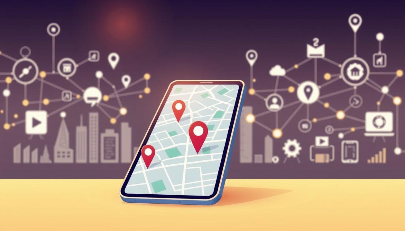
Smartphones are reshaping how customers find products and services. Over 59% of global web traffic now comes from handheld devices, and experts predict 72% of users will rely solely on phones by 2025. If your website isn’t optimized for these visitors, you’re missing opportunities to connect with nearby buyers.
Search engines prioritize websites that load quickly and display properly on smaller screens. Algorithms now penalize pages that aren’t responsive, pushing them lower in results. This shift means businesses must adapt their online presence to match how people browse today.
Customers increasingly use voice commands or “near me” queries to find solutions. Over 60% of these searches lead to in-store visits within 24 hours. Without a strategy tailored to smartphone users, your competitors could dominate these high-intent moments.
Optimizing isn’t just about technical adjustments—it’s about meeting expectations. Slow-loading pages or poorly formatted content frustrate visitors, causing them to abandon your site. In a crowded digital marketplace, seamless mobile experiences build trust and drive conversions.
Key Takeaways
- Smartphones will drive 72% of internet usage by 2025, making mobile-friendly sites non-negotiable
- Search engines prioritize responsive designs in their ranking algorithms
- “Near me” searches frequently result in in-person visits within one day
- Slow-loading pages increase bounce rates and damage customer trust
- Mobile optimization directly impacts your visibility in local search results
Introduction: Setting the Stage for Mobile Optimization
By 2025, 72% of online activity will happen through handheld screens. This shift changes how people discover products and make buying decisions. If your site isn’t built for these users, you risk losing visibility where it matters most—search results.
Overview of Mobile Trends in 2025
Handheld devices now serve as the primary tool for discovering services. Over 76% of nearby customers visit stores within 24 hours of finding them through searches. Quick access to details like addresses and hours drives these actions.
| Metric | Statistic | Impact on Businesses |
|---|---|---|
| Same-Day Visits | 76% | Drives foot traffic from nearby shoppers |
| Purchase Rate | 28% | Directly boosts revenue from searches |
| Screen Time | 4.8 hours/day | Increases exposure opportunities |
Implications for Small Businesses
Customers expect instant answers formatted for small screens. Slow websites or cluttered layouts push users toward competitors. Adapting your strategy ensures you meet these demands effectively.
Traditional desktop-focused designs fail to engage modern audiences. Updating your online presence helps you capture attention during critical decision-making moments. It’s not just about aesthetics—speed and clarity directly influence trust.
Essential local mobile SEO Strategies
Handheld devices dominate how people discover nearby services. Tailoring your website for these users requires strategies that blend technical adjustments with location-aware content. This approach ensures you meet customers where they’re actively searching—on their phones.
Defining the Role of Mobile SEO in Local Markets
Mobile SEO focuses on enhancing site elements for handheld users. It prioritizes features like voice search compatibility and GPS-based queries. For example, 63% of shoppers check store hours via mobile before visiting.
Traditional methods often overlook how phone users interact with content. Mobile-first optimization considers thumb-friendly navigation and instant loading speeds. These factors determine whether users stay engaged or abandon your site.
Key Benefits for Your Business
| Advantage | How It Works | Result |
|---|---|---|
| Higher Rankings | Search engines favor mobile-ready sites | Top 3 search positions |
| Faster Conversions | Simplified checkout processes | 28% more purchases |
| Stronger Engagement | Content formatted for quick scanning | 42% longer session times |
These strategies help you compete effectively against larger companies. By meeting modern browsing habits, you turn casual searches into loyal customers. It’s about being visible when decisions happen—often within 500 feet of your location.
Mobile-First Indexing and Its Impact on Search Rankings
Google changed the game in 2016 by prioritizing your phone-friendly content over desktop versions. This means their algorithms now check your mobile site first to decide where you appear in search results. If your pages aren’t optimized for smaller screens, you could drop rankings—even for users on computers.
Understanding Mobile-First Indexing
Search engines like Google crawl the mobile version of your website to determine relevance. If your desktop site has more content than your mobile site, those extra details won’t count toward your rankings. This shift ensures users get consistent experiences across devices.

| Factor | Mobile Version | Desktop Version |
|---|---|---|
| Crawling Priority | Primary source | Secondary source |
| Content Visibility | Must match desktop | Ignored if mobile exists |
| Loading Speed | Under 3 seconds | Less critical |
How It Affects Local Search Results
When someone searches for “coffee shops near me,” Google uses mobile-first indexing to pick the best matches. Businesses with slow-loading sites or broken buttons often disappear from top results. Over 60% of these searches lead to visits within a day—so every technical flaw costs sales.
Optimizing your mobile site isn’t optional anymore. Use tools like Google’s Mobile-Friendly Test to spot issues. Fixing layout problems or speeding up load times keeps you competitive in local searches. Remember: what works on desktops might fail on phones.
Best Practices for Mobile Site Design and Navigation
Mobile visitors expect instant access to information without struggling with cluttered layouts. Your site’s design must prioritize simplicity and speed to keep users engaged. Let’s explore how to structure pages for effortless navigation and lightning-fast performance.
Optimizing Navigation for Small Screens
Limit menu items to 5-7 key pages like “Contact” or “Services.” Hamburger menus work well but label them clearly—users should know where to find critical links. Buttons need spacing of at least 48 pixels to prevent misclicks.

Group related actions under intuitive icons. For example, use a shopping cart symbol instead of text links. This approach reduces visual clutter while guiding visitors toward conversions.
Design Elements for Fast Load Times
Compress images to under 100KB without losing quality. Formats like WebP cut file sizes by 30% compared to JPEGs. Avoid heavy scripts that delay rendering—lazy-load non-essential elements as users scroll.
| Element | Optimal Size | Impact on Speed |
|---|---|---|
| Images | ≤100KB | Reduces load time by 1.2s |
| Fonts | 2-3 families | Saves 500ms on render |
| Code | Minified CSS/JS | Improves parsing by 40% |
Prioritize content above the fold. Load core text first, then add interactive features. With 5G spreading, users abandon sites that take over 3 seconds to display key information.
Improving User Experience on Mobile Devices
People interact with handheld screens differently than desktops—quick glances, one-handed scrolling, and split-second decisions. Your content must adapt to these behaviors to keep visitors engaged. Let’s explore how to design pages that work with how users naturally browse.
Strategies for Enhancing Readability
Small screens demand clear visual hierarchies. Use 16px fonts as a minimum—smaller text strains eyes during quick scans. Pair dark gray text (#333) with white backgrounds for better contrast in sunlight. Break content into 2-3 sentence chunks with bold subheadings every 80 words.
| Element | Desktop Standard | Mobile Optimization |
|---|---|---|
| Font Size | 14px | 16px+ |
| Line Spacing | 1.5 | 1.6-1.8 |
| Contrast Ratio | 4.5:1 | 7:1 |
Designing Thumb-Friendly Interfaces
Place key buttons where thumbs naturally rest—the bottom third of screens. Leave 8-10mm gaps between clickable elements to prevent mis-taps. Use circular or pill-shaped buttons (40x40px minimum) for actions like “Call Now” or “Get Directions.”
Group related features in expandable menus to reduce clutter. For example, collapse secondary navigation under a “More” tab. Test layouts by holding your device—can you reach every interactive zone without stretching? If not, reorganize priority actions.
Technical Optimization: Speed, Responsive Design, and Structured Data
Technical precision separates thriving sites from overlooked pages in handheld search results. Three core elements determine whether your content performs: adaptability across screens, structured data clarity, and lightning-fast loading.
Implementing Responsive Design Principles
Your pages must reshape seamlessly across different screen sizes. Use CSS media queries to adjust layouts automatically. Test designs on actual handheld devices—emulators often miss real-world quirks like touch responsiveness.
Structured Data for Rich Snippets
Schema markup acts as a translator for search engines. Add JSON-LD code to highlight key details like business hours or product prices. This helps your listings stand out with extra visuals in results.
| Schema Type | Data Included | Visibility Boost |
|---|---|---|
| LocalBusiness | Address, phone, reviews | 23% more clicks |
| Product | Price, availability | 37% faster purchases |
| FAQ | Common questions | 18% longer engagement |
Improving Mobile Page Speed
Compress images to WebP format—they load 25% faster than PNGs. Minify CSS and JavaScript files by removing unnecessary spaces. Choose a hosting provider with edge servers to reduce data travel time.
Run monthly speed tests using Lighthouse. Prioritize fixes that shave off half a second or more. Even minor improvements keep visitors engaged and search rankings high.
Leveraging Local SEO Techniques for Increased Visibility
Visibility in neighborhood searches separates thriving stores from hidden storefronts. Over 76% of shoppers check business details on their devices before visiting. To stand out, you need strategies that align with how search engines and customers evaluate nearby options.
Optimizing Your Google Business Profile
Your free Google Business Profile acts as a digital storefront. Choose precise categories like “Family-Owned Bakery” instead of generic terms. Add photos weekly—locations with updated images get 35% more requests for directions.
| Profile Element | Optimized Approach | Impact |
|---|---|---|
| Categories | Select 3-5 specific terms | 42% higher search visibility |
| Photos | Upload 15+ quality images | 27% more website clicks |
| Reviews | Respond within 24 hours | 18% boost in trust |
Encourage reviews by sending follow-up emails after purchases. Profiles with 100+ reviews dominate 68% of local searches. Address negative feedback politely—resolve issues publicly to show commitment.
Maintaining Consistent NAP Information
Name, address, and phone number (NAP) mismatches confuse search algorithms. Verify your details match exactly across directories, social media, and your website. Even minor differences like “St” vs “Street” hurt rankings.
| Platform | Common Errors | Fix Strategy |
|---|---|---|
| Website | Outdated hours | Update footer & contact page |
| Directories | Missing suite numbers | Audit listings monthly |
| Social Media | Inconsistent phone formats | Use (555) 123-4567 pattern |
Set quarterly reminders to check citations on platforms like Yelp and Apple Maps. Consistent NAP details improve credibility—88% of users distrust businesses with conflicting information online.
Strategic Content Creation for Mobile Users
Creating content for handheld screens demands a shift in strategy. Users scroll quickly and decide in seconds whether your page meets their needs. Your approach must balance clarity with strategic keyword use to capture attention and deliver value.
Creating Scannable, Engaging Content
Break information into bite-sized chunks. Two-sentence paragraphs and bold subheadings guide eyes through your message. Bullet points work better than dense paragraphs—they let readers grasp key points without effort.
| Element | Desktop Approach | Mobile Optimization |
|---|---|---|
| Paragraphs | 4-5 sentences | 1-2 sentences |
| Subheadings | Every 300 words | Every 80-100 words |
| Visuals | Decorative images | Purposeful infographics |
Using Proper Keyword Placement on Mobile
Start titles with your most important terms. Narrow screens show only the first 4-5 words in search results. For example, “24-Hour Plumber: Emergency Repairs” outperforms “Emergency Plumbing Services Available 24/7.”
Incorporate keywords naturally in the first sentence of paragraphs. Avoid stuffing—focus on answering questions users ask during on-the-go searches. Phrases like “how to” or “best way” align with voice search patterns common on phones.
Dedicated Tools and Resources from SEO Local
Professional tools transform how you approach technical challenges in site performance. SEO Local provides tailored solutions that simplify complex processes, letting you focus on growth instead of technical headaches.
Insights on Tools for Mobile Optimization
Automated audits identify issues like slow-loading images or broken links. Our platform generates prioritized fixes—from compressing files to restructuring code—so you know exactly where to start. For example, Google PageSpeed Insights reveals critical speed bottlenecks but often requires developer expertise to implement changes.
SEO Local bridges this gap by translating technical recommendations into actionable steps. Our team handles backend adjustments while explaining impacts in plain language. You maintain control without needing coding skills.
How We Support Your Strategy
Continuous monitoring ensures your pages adapt to evolving standards. Weekly reports track improvements in load times, click-through rates, and search visibility. This proactive approach prevents minor issues from becoming ranking roadblocks.
Connect via WhatsApp for real-time guidance on urgent updates or long-term planning. Whether adjusting structured data or refining content layouts, our experts provide clear next steps tailored to your goals.
Ready to streamline your approach? Message us at https://wa.me/17868409644 for personalized solutions that drive measurable results.
Conclusion
Your digital presence must evolve as browsing habits shift. By 2025, handheld devices will influence nearly three-quarters of purchasing decisions. Adapting your strategy now positions you to capture these critical moments.
Optimizing for smaller screens isn’t just technical—it’s strategic. Sites that load quickly and display clearly earn trust faster. This directly impacts whether customers choose you over competitors in search listings.
Focus on simplicity. Streamlined navigation and concise content keep visitors engaged. Tools like Google’s Mobile-Friendly Test help identify areas needing improvement without guesswork.
Businesses that prioritize these adjustments see measurable growth. Higher visibility leads to more foot traffic and conversions. Start refining your approach today to secure your place in tomorrow’s search results.
FAQ
How does mobile-first indexing affect my site’s visibility?
Search engines prioritize pages optimized for smaller screens. If your site isn’t responsive or loads slowly on devices, it may rank lower in results, making it harder for customers to find you.
What design elements improve load times on phones?
Compressed images, simplified code, and avoiding heavy scripts boost performance. Faster pages keep visitors engaged and reduce bounce rates, which can positively impact your rankings.
Why should I prioritize thumb-friendly interfaces?
Over 75% of people use one hand to navigate on devices. Buttons placed within easy reach and minimal scrolling create smoother interactions, increasing the likelihood of conversions.
How do I ensure consistent NAP details across platforms?
Regularly audit your business name, address, and phone number on directories like Google Business Profile and Yelp. Inconsistent information confuses search algorithms and potential customers.
Can structured data enhance my listings in search results?
Yes. Schema markup helps engines understand your content, enabling rich snippets like star ratings or event dates. This can make your listings stand out and attract more clicks.
What tools help track performance for device users?
Google’s PageSpeed Insights and Mobile-Friendly Test identify technical issues. Platforms like SEMrush or BrightLocal offer deeper insights into rankings and competitor strategies.


